


read about the process
problem
For my Global Digital Media Project I Course, I was tasked in a team of 3 students to ideate and prototype a virtual reality application under the scope of post-secondary student mental health. Undergraduate students need access to more immediate and convenient support to manage their mental health challenges. With our product, my team attempted to find a solution to the following problem:
How might we help domestic and international undergraduate students manage their mental health with XR technology?
intial research
To better understand the scope of the problem, our team conducted a literature review of peer-reviewed research on undergraduate mental health and sound therapy, alongside user interviews and a thematic analysis. Interview participants included six undergraduate students: three domestic and three international.
Based on our findings, we identified the following pain points:

A lack of awareness for mental health support in post-secondary institutions.

Students do not have access to enough positive mental health coping strategies
Exisiting support for students have barriers to physical access.
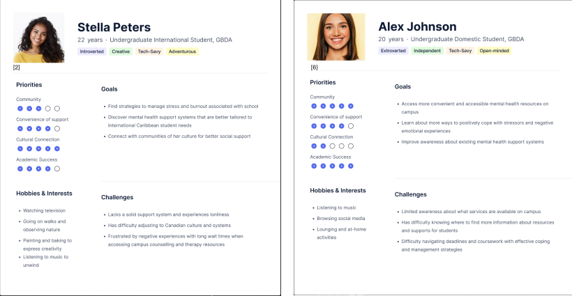
Building on our research, we developed user personas and task descriptions to identify key requirements and essential features for our design.
ideation
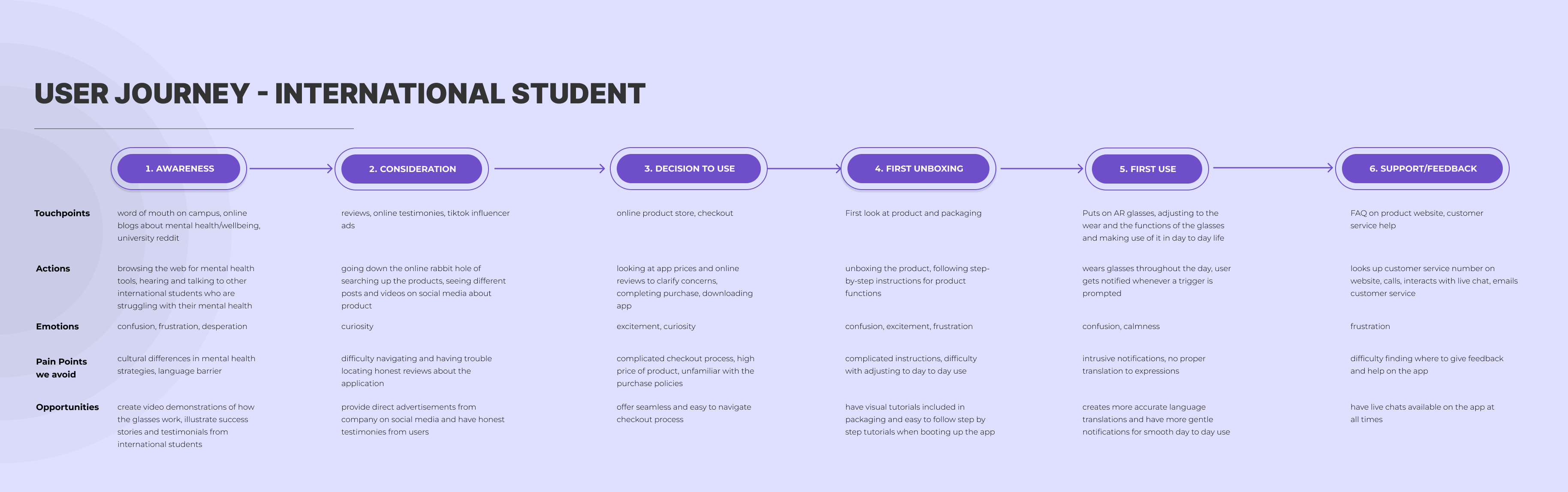
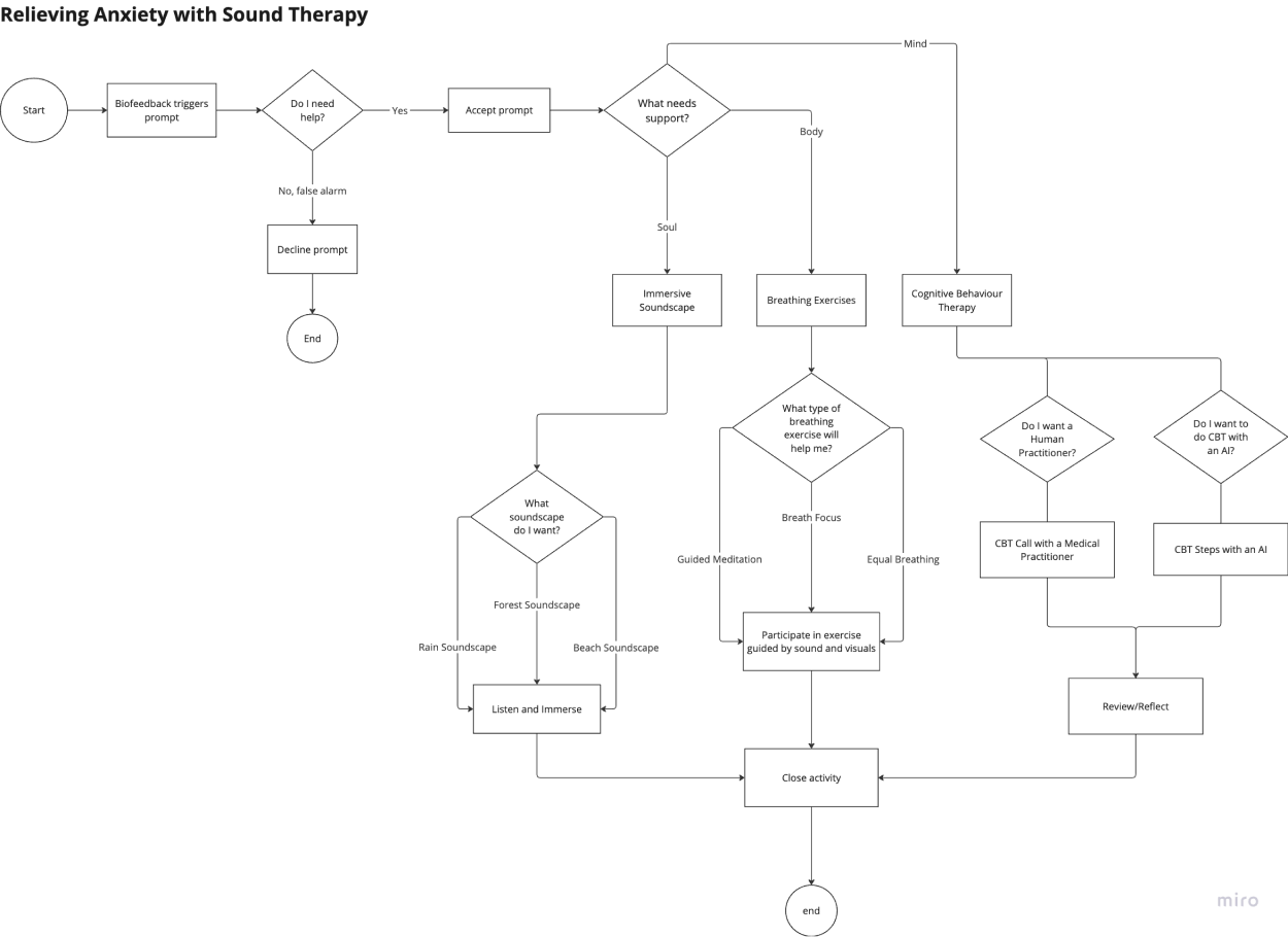
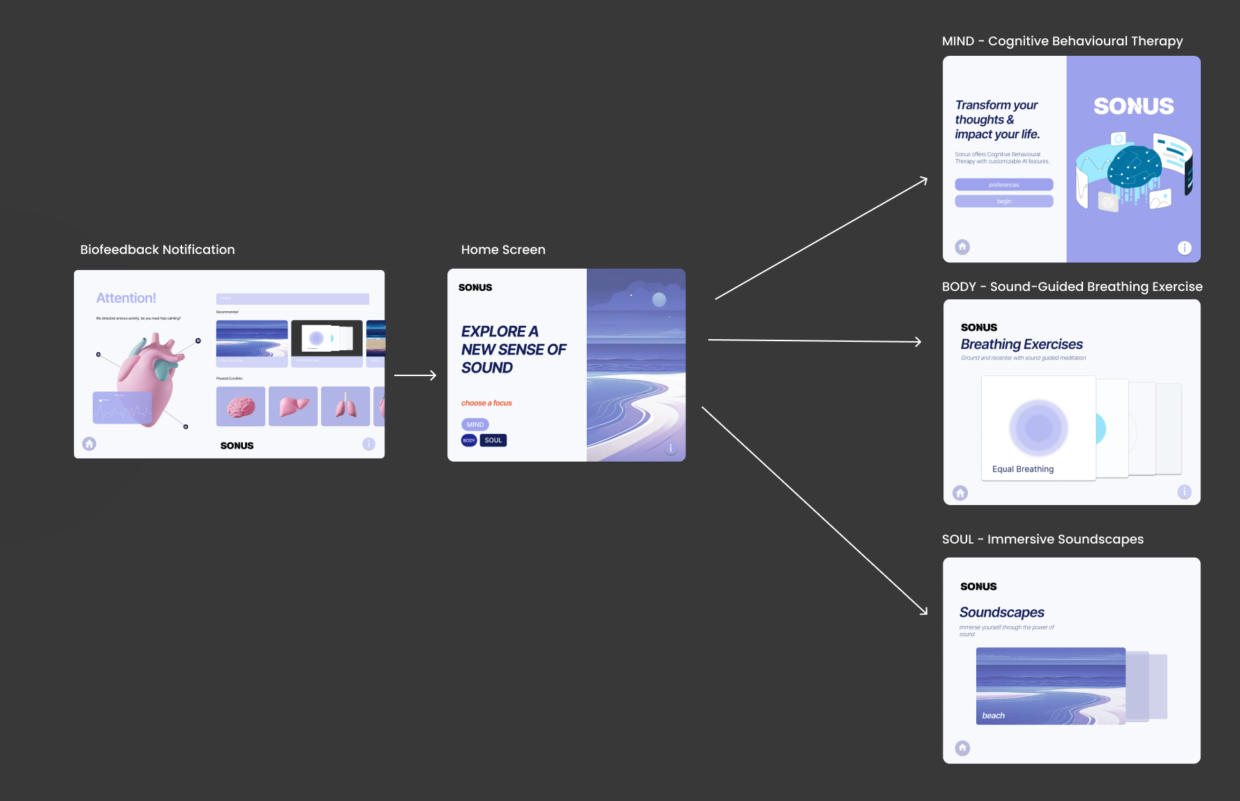
During the ideation phase, our team employed both user journey maps and user flow maps to visualize how users would interact with our product from start to finish. These tools helped us analyze key user decisions, track interactions across various touchpoints, and identify potential barriers or pain points along the way. By considering these elements, we aimed to create a more seamless and intuitive user experience, ensuring that the design addressed both user needs and any challenges they might encounter.
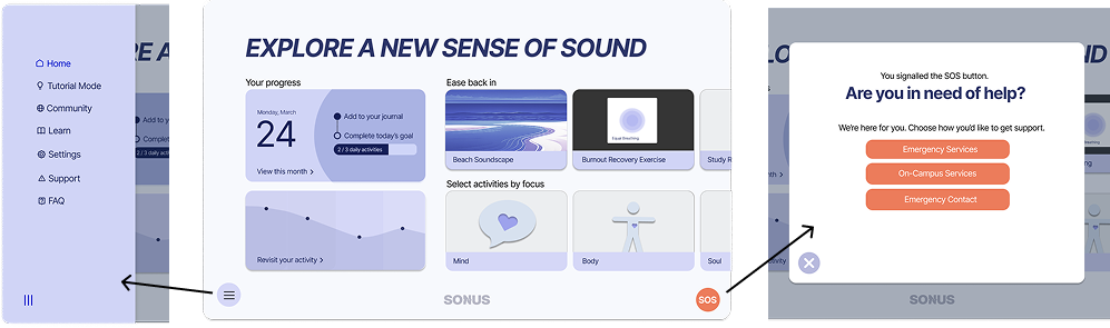
After evaluating user interactions, we identified the key features for our application and incorporated them into the wireframes for our main screens. This allowed us to visualize how these interactions would fit into the logical structure and navigation of Sonus.

user testing
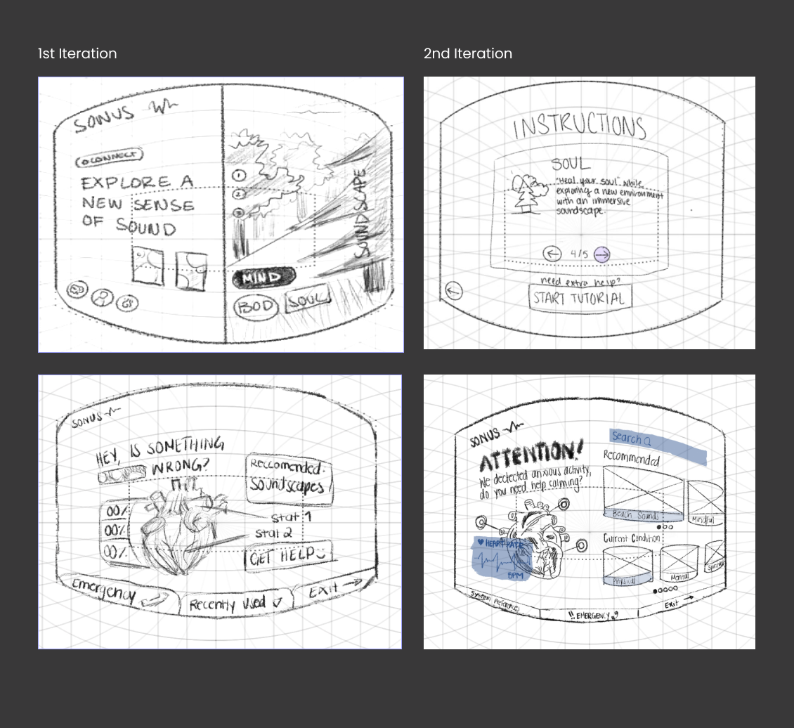
Our design underwent several iterations before arriving at the final high-fidelity prototype. At each prototype stage, we conducted user testing to assess the usability and overall user experience of our application, allowing us to pinpoint areas for improvement.

After developing our initial low-fidelity prototypes, we used the Think-Aloud Protocol alongside post-interviews and System Usability Scale questionnaires to gain insights into user challenges and perceptions.

Testing results revealed that users most commonly experienced the following challenges:
- Users found difficulty navigating between certain features within the application
- More icons and visual cues could have been used to help users learn the system with ease
- Our initial low-fidelity prototypes lacked a sufficient number of screens to help users intuitively complete their tasks
Based on these findings, we iterated through three major design changes:
- Designing a tutorial feature for users to opt-in to a modified app experience that provides step-by-step instructions for navigation
- Simplifying buttons with clear and direct language
- Adding a recommeneded section to our biofeedback prompt screen, giving users a clearer understanding of what to do next
brand story
Before developing our final high-fidelity prototypes, our team worked together to craft the brand story for Sonus. This process involved defining the brand's purpose, promise, personality, and values, ensuring that every design decision aligned with the core identity of the product. By establishing a clear and cohesive brand narrative, we aimed to create a meaningful connection with users and our product's story.

Purpose: SONUS offers immediate and personalized relief to undergraduate students experiencing anxiety and stress throughout the day. Focused on the mind, body and soul, SONUS provides an immersive space for students to recenter their emotions and seek comfort through the power of sound.
Promise: Recognizing the demanding and dynamic nature of undergraduate lifestyles, SONUS is dedicated to providing accessible relief for effective mental health support. Students can rely on SONUS for calming and supportive experiences whenever and wherever they may need it. We empower students to take autonomy over their well-being while promoting healthy wellness habits.
Brand Values: Comfort, Accessibility and Personalization
Brand Personality: Supportive, Empowering, Serene
solution
The Sonus experience integrates evidence-based coping strategies—including guided breathing exercises, immersive soundscapes, and an AI chatbot inspired by Cognitive Behavioural Therapy—to support students in managing stress and anxiety. Grounded in the brand values of comfort, accessibility, and personalization, the solution creates an immersive space where students can regulate emotions, build healthy habits, and find moments of calm through sound-driven support.
stakeholder
analysis
As part of my Ethics & Values in Design course, I conducted a stakeholder analysis to inform the redesign of the homepage. This analysis focused on identifying key stakeholder groups and examining how their values shape expectations and interactions with the Sonus experience.

To translate these values into actionable design requirements, I collected survey data from post-secondary students as well as their family members and friends, exploring priorities related to mental health management, relationships, and lifestyle.
Among post-secondary students, the highest-rated values were Well-Being, Convenience, and Autonomy, reflecting a desire for accessible and self-directed mental health support. In contrast, family members and friends prioritized Safety, Transparency, and Happiness, highlighting concerns around trust, clarity, and long-term emotional outcomes.
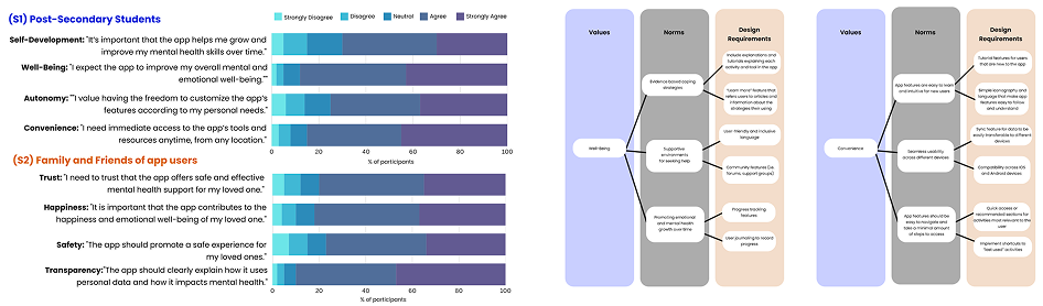
Identifying these user priorities directly informed the following design requirements for the homepage redesign:
- User control: Customizable settings for data use and interface preferences
- Personalization: Quick access to recent and frequently used activities
- Progress tracking: Dashboards, goals, and journaling to support habit-building
- Ease of use: Tutorial mode to guide onboarding and activity usage
- Transparency: “Learn More” content explaining mental health strategies
- Trust & safety: FAQ, privacy documentation, and in-app support access
- Community support: Links to external resources and local support programs
These insights reinforced the need for a solution that delivers effective, personalized, and secure support while balancing user independence with reassurance for loved ones.
design system
During my second co-op term, I participated in a design system workshop where I created a comprehensive design system for Sonus. The system defined accessible color palettes, typography, spacing, and reusable components to ensure visual consistency across the product.
I built and documented the system in Figma, leveraging auto layout, component variants, and design tokens, with a strong focus on accessibility and responsive design.
takeaways
User-Centered Iteration: Through multiple rounds of user testing and feedback, we refined the design to better meet the needs and expectations of our target audience. This iterative process highlighted the importance of continuously validating design decisions with real users.
Navigating Usability Challenges: Identifying and addressing usability issues, such as navigation difficulties and lack of customization options, was key to improving the overall user experience. These changes contributed to a more intuitive and personalized product.
Design Flexibility and Customization: Providing users with customizable options, such as personalizing soundscapes, allowed for a more engaging experience, giving users a sense of control over their journey to relaxation.

